Let’s face it. If you haven’t considered capturing mobile customers, you are missing the big picture.
According to Google, 50% of mobile search conversions happen in one hour. This is known as mobile’s Immediacy Effect.
The proper mobile design can drastically affect your sales. The proof is in the pudding.
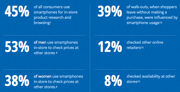
(via Google)
Creating a strong mobile experience isn’t rocket science. Intuitively, smartphone users will respond better to sites that allow for the quickest means to their end-goal. This could be purchasing a pizza or booking a flight.
Keep it simple
It is important to consider your website’s core functions. Start first by considering the absolutely essential functions needed for visitors to reach the finish line. Cut out all the fat and conceptualize your site based on customer-centric functions.
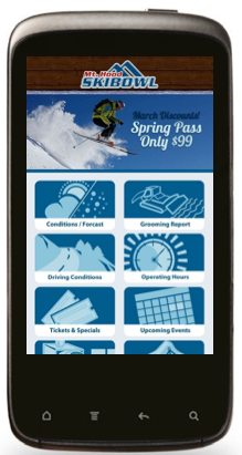
In this example, Ski Bowl Resort has taken its customer-centric functions and translated them into an effective mobile experience with minimal scroll.
Make functionality BIG
By trait, mobile users have fat fingers. If a customer needs to zoom to navigate your site, you have failed. Create every aspect of your mobile site with the idea of ‘big buttons.’
In this example, the outdoor brand, Ride Snowboards represents product categories with big colorful buttons.

Optimize all stages of the customer journey
It is important to test your site’s flow. You don’t want to lose people due to inconsistent functionality. This is especially true for large e-commerce sites.
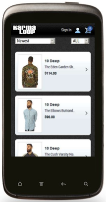
In this example, Karmaloop considers optimized design for multiple stages of the ecommerce sales cycle.

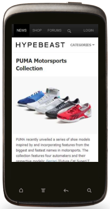
Make content easily consumable
Content is consumed more than ever on mobile phones and tablets. The trick is to make sure your content is navigable on a mobile interface. This is needed for text, videos and images. A good design will render text bigger. Videos must be able to load full screen. Images will be big. Think big!
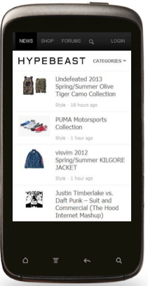
In this example, Hypebeast creates ease-of-use for written content and images.
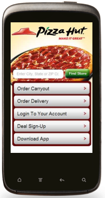
Make it fast
The breaking point for a fast mobile site is about 5 seconds. If your site is loading slower than that, consider slimming down. Go back to the idea of simplified functionality. Cut out any unnecessary flash or slow-loading media elements. These may prolong your load time.
In this example, Pizza Hut presents its product perfectly on the mobile interface. The site makes your mouth water in about 2-5 seconds.
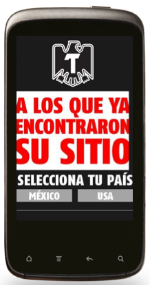
Build your brand with the interface
Big branding is sexy with mobile. Every page of your site needs a fat logo up top. The mobile interface provides an opportunity for a more impactful brand impression than the desktop experience. Take advantage by designing a minimalist branded look.
In this example, Tecate establishes brand dominance with this clean homepage design.
This mobile thing is growing! Support our hunger to learn more by posting questions in the comments below.