Optimizing a website can take on a lot of different paths, all of which are actually connected. Businesses are built around optimizing websites for search (SEO), mobile, user experience, content, conversions, accessibility and more. Here, I am going to focus on optimizing a site design for the user experience. Read on for how to use tools to see how your users are interacting with your website, how you read/review that data and how to turn that into actionable next steps.
Optimize, General: Make the best or most effective use of a situation, opportunity, or resource.
Optimize, Digital: Rearrange or rewrite data, software, layouts, etc. to improve the efficiency of retrieval or processing.
Why should I optimize my website?
One of the biggest mistakes a business can make is assuming your site works fine for all users without hiccups or issues. User issues can be as simple as a hyperlink not working or as complex as being unable to find the information they need. While making the investment in optimizing your already built website may be a tough pill to swallow, the cost of losing customers, sales, or a solid reputation is much worse. Often, making simple changes as part of improving the user experience can actually improve performance quickly and can have a real business impact fast.
What tools are out there and what can the data tell you?
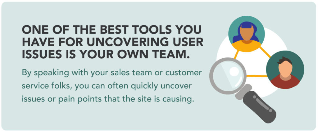
One of the best tools you have for uncovering user issues is your own team. By speaking with your sales team or customer service folks, you can often quickly uncover issues or pain points that the site is causing. Building a feedback channel between various teams within your business and the web optimization team or agency is a great first step in building out your optimization tools.
With that in place, tools exist to make data collection and analysis easier. Below are some common and cost-effective tools available.
Heatmap Software
Heatmaps give you an easy visual of how users have navigated pages on your site. You can easily see how far down on the page your users are scrolling, what copy they are viewing, and most importantly where they are clicking. The most common things uncovered with heatmapping are:
- Text or images users anticipate being clickable links that are not
- Important content that is not being seen because users don’t scroll far enough down the page
- CTAs that are being missed and could be moved to a more user-friendly position on the page
Heatmaps can also tell you a story of where your users are most likely to go from the current page.
User Recordings
One of our favorite, though time-consuming, tools to get insights is user recordings. With these our user experience strategists can watch real-life users move through a website. The key to the success of this data collection is having a good sample size of random users. User recordings can show and tell you when users are frustrated when they are having to u-turn (hit the back button), where they are running into technical issues or unknown site errors. We recommend starting with 50 user recordings and writing down what they are doing and what insights you are gathering from their experience. Once you have a good sample size then you can go back and watch users on specific pages or paths.
Most 3rd party software will include both user recordings and heatmaps. Depending on what else you are looking for they can also feature user flows, dev tools, analytics and more. A few to look into: Hotjar, Microsoft Clarity, Full Story, Crazy Egg, and Mouse Flow.
Google Analytics 4 (GA4) and Google Tag Manager
Using Google’s suite of tools, you can see what pages your users are visiting and not visiting and where they are dropping off. You can learn a bit about the demographic of your users to help infer what they may need as well. By setting up specific tags, you can track what users are clicking on and what they are doing. Then make informed decisions on what pages to run heatmaps on or watch user recordings. This can allow you to remove or move necessary information to another location.
Optimizely
There are a few different tools out there that have similar testing options. With these tools, you set up goals on your website and conduct A/B testing on various elements to improve conversations and engagement. These tools are great to find out what button color or copy performs better, which headlines grab folks more than others and what section of the site seem to be the most popular and therefore could have the most opportunity for growth. This is a great way to test out your theories first before implementing sweeping changes that may not have a big impact but could cost significant dollars.
Common user experience issues in design we see
We could rattle off 101 user experience issues we’ve seen through our work but here are a few items we see frequently and should be kept top of mind.
- Using complicated or unclear headlines. Use simple, straightforward headlines and subheadlines as much as possible. On average we see at least a 2% increase in conversions when we adjust headlines to be more straightforward.
- Using complicated navigation structures and naming. The navigation is your store signage. If it’s not clear, folks can’t find what they are looking for. Keep your navigation as simple as you can so it is very clear what your site is offering and where to find it. It’s tempting to break the mold and get creative with page names or sections. But users have built expectations around what they need to see in the navigation to move quickly. If they can’t find it or have to think too hard about it, they will leave.
- Putting important information at the bottom. Users in general are not scrolling all the way to the footer of all pages. If you have important information at the bottom of the page, most likely your users are not seeing it. Often companies think users scroll to the bottom of the homepage but we typically see only around 20% make it. Keep the footer and lower space for links common to that space but not your only call-to-action.
- The design needs to help confirm what is clickable. Users try to click on EVERYTHING. Make it clear what is hyperlinked and give them something useful to click on to move them through your site. Don’t forget to hyperlink images, more often than not when an image is close to a CTA users will also try to use the image as a click-through.
- Product images are not user (or mobile) friendly. Users love photos, especially when it comes to eCommerce sites. You’d be surprised at the number of users that want to zoom into a photo and view details. Spend the time to make sure your photography is polished and the tools used in those product scenarios work perfectly on all platforms.
- Using a whole lot of words for SEO purposes. User’s skim! In general, most of your users are not reading all of those paragraphs of copy. Content is great for SEO and it can be great for users if it is laid out the right way. Use subheadings, bullet points, and short paragraphs to make it easier for the user to digest.
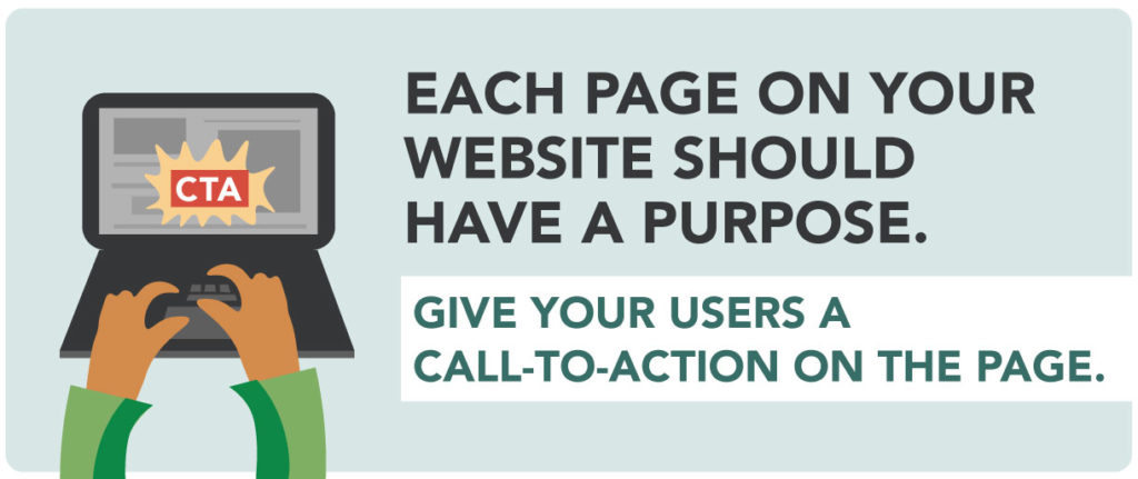
- Forgetting a call to action. Each page on your website should have a purpose. Give your users a call-to-action on the page. Guide the user in the path that will help them find what they need and what you value most. Pages can have more than one CTA if it makes sense but don’t add too many or the user won’t know where to go next. Again, think simple if you want better performance.
How to turn the data into actionable next steps
You have a bunch of data. You have your eyes out for issues you know can be a problem. What happens next? Here is a quick roadmap to user experience success.
- Make a list of wins: What elements are winning on your site, what information does your user enjoy and where are they converting.
- Make a list of issues and opportunities: Where are they not clicking, where are they dropping off, where are there bugs or breaks?
- Collaborate! Grab your team or another person and talk through what you found. Sometimes the best solutions come from conversations and brainstorming.
- Prioritize the issues and opportunities: Sometimes a high priority could be the easiest item to check off your list or the largest impact to your business. Prioritize based on the biggest impact to results, easiest to undertake or other KPIs you may have. It’s best to start with a list and move them around to make it work for your team and timeline.
- Make the update(s): Make the change and measure the results. Depending on the change and the impact you expect to see, use the tool(s) again and confirm it had the result you were expecting.
- Continue to refine and optimize: What works one quarter may not work the next. A website should grow and change with the business and goals. Building regular testing and optimization into your digital marketing efforts is imperative to ongoing success.
Our Optimization Work
At Mad Fish, we serve a variety of customers all looking for expert user, SEO, and campaign optimization. If your website isn’t delivering the results you want, we can help. Contact us today to learn more.