Searching for something on Google is like trying to find a new show to watch on Netflix or HBO. If your first choice stinks, there is no shortage of alternatives that may be more up your alley.
First impressions are critical; there are no redo’s.
If people can’t even sit through your pilot, there is no way they will stick around for the entire season.
You want to make sticking around a no-brainer.
If your homepage is the pilot, your navigation is the segue to episodes two, three and beyond. If your navigation is convoluted and unintuitive, you are well on your way to being cancelled.
4 Costly Website Navigation Mistakes
- Utilizing Excessive Flyout Menus
- Clogging Your Primary Navigation with Unimportant Pages
- Failing to Move Visitors into Your Customer Acquisition Funnel
- Emphasizing the Wrong Pages
Mistake #1: Using Excessive Flyout Menus
We have all been there. You go to a site, hover over the menu, hover over an item of interest in the initial dropdown, and a flyout menu pops up to the side.
No big deal.
Suddenly, that first flyout menu turns into a second and third flyout menu, and the next thing you know the menu is spanning the entire width of the page.
Then it happens: your mouse accidentally moves too far away from the flyout menu, it closes, and you have to start all over again!
Ugh.
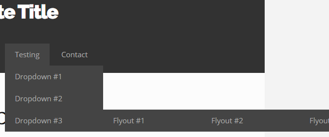 The entire flyout menu wouldn’t even fit in this image at 100% scale. And it overlapped the fixed width of the site!
Unfortunately, many WordPress templates default to flyout menus, which makes it easy to go overboard with the nesting of pages.
Note: One level of flyouts is perfectly acceptable (such as what we use here at Mad Fish Digital).
Fortunately, there are a lot of superior alternatives.
- (Selective) Dropdown Menus
- Secondary Navigations
- Mega Menus
- etc.
Dropdown menus — the precursor to flyout menus — often get a bad rap, too; however, they are still effective when used strategically (and with minimal flyouts).
Moz does a great job of this. Clean, concise, and without flyouts:
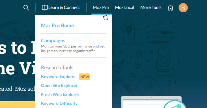
As you navigate to different sections of their site, they also do a good job of utilizing secondary navigation beneath the primary navigation.

Secondary navigation is a second set of navigation visible only after reaching a certain page of a site. It is not a global menu; it is section-specific. It provides a perfect opportunity to feature links to supporting content for the page being viewed.
Another popular choice is mega menus.
Commonplace on large e-commerce sites and for companies offering a wide variety of services, mega menus are dropdown menus on steroids. They show absolutely everything within a section or category, yet don’t require visitors to play a frustrating game of hovering (à la flyouts).
Nothing is hidden. Everything is easily accessible instead of buried within multiple layers of needless hierarchy.
Getting Started with Mega Menus
- Max Mega Menu — This WordPress plugin makes setting up mega menus a cinch
- DIY Tutorial — This tutorial guides you through the process of manual implementation
Mistake #2: Clogging Your Primary Navigation with Unimportant Pages
Create page, add to menu. Create page, add to menu. It’s like a bad habit.
Not every page of your site deserves to make the primary navigation’s final cut. Be selective.
The goal of the primary navigation is to put your best foot forward. Visitors should be able to quickly grasp what it is that you are offering and continue on to each section of the website without having to struggle to do so.
Pop Quiz
Which of the following pages belong in your primary navigation?
- Careers
- Affiliate Program
- Partners
- Privacy Policy
- Terms & Conditions
- Site Map
- Cookie Policy
- Help
- Feedback
- Return Policy
In the vast majority of cases, the answer is zero.
They belong in your footer.
Think of it this way:
Pages not moving visitors into your customer acquisition funnel don’t belong in your primary navigation.

Speaking of which…
Mistake #3: Failing to Move Visitors into Your Customer Acquisition Funnel
Your site needs to help potential customers feel confident in your company and its services.
People want to know they are making the best choice possible. This is true for B2C; this is true for B2B — it doesn’t matter. It’s why things such as user reviews, testimonials, certifications, awards, and all methods used to establish trust are so important.
Since your primary navigation is one of the first things visitors see, it’s crucial that everything is clear, concise, and easy to find. It, too, is a method used to establish trust.
Your site’s navigation is basically an elevator pitch. Keep it short and persuasive, but be substantive.
The flow of your navigation should be as follows:
Main Offering ➡ Supporting Content
Or, in dropdown format…
- Main Offering #1
- Supporting Content #1
- Supporting Content #2
- Supporting Content #3
Repeat this format along your primary navigation until all key entry points into your customer acquisition funnel are covered.
The same thing goes for each use of secondary navigation.
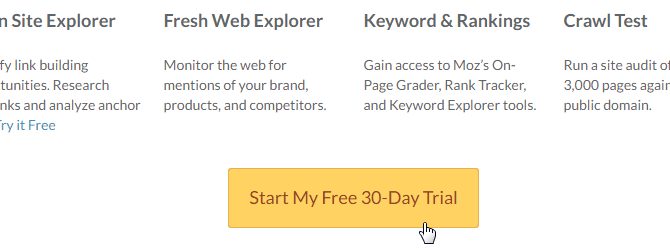
Let’s jump back our previous example of the secondary navigation used at Moz:
Here, “Products” represents the Main Offering, while Overview, Features and Pricing represent the Supporting Content.
Notice how the secondary navigation doesn’t include links to every single product offered.
Within each piece of supporting content are numerous opportunities to convert:
This is important!
Each piece of supporting content must include a minimum of one call to action (CTA) that gives visitors a chance to move further down your funnel.
Potential CTAs include links/buttons that move people toward your products/services (as demonstrated above), newsletter opt-ins, gated content, etc.
Caution: Avoid being overly aggressive. The goal is to earn customers while simultaneously building customer trust.
Mistake #4: Emphasizing the Wrong Pages
As you gather data for your site through an analytics platform (e.g. Google Analytics), you will be able to pull usage statistics for every page on your site. From this, you can see which pages people care about the most and which pages are being neglected.
For popular pages that meet the criteria outlined in this article, you may see an opportunity to increase their prominence through slight rearrangements of your navigation.
For any page that meets the criteria outlined in this article but isn’t performing well, you have several options:
- Scrap it
- Move it (e.g. into your footer)
- Improve it
If you know the page is important to your visitors’ decision-making process, you will need to improve the content on that page in order to better resonate with readers.
Look for information that may be missing. Preemptively answer potential questions. Add clarity.
For robust topics, consider tackling things from a 10x content approach.
Key Takeaways
- Avoid excessive flyout menus (i.e. anything beyond one level); instead, consider (selective) dropdown menus, secondary navigations, and mega menus
- Identify any links in your primary navigation not vital to the acquisition of customers (but that are still important) and move them to your footer
- Structure everything in a way that moves visitors into your customer acquisition funnel
- Emphasize popular pages in your navigation; scrap, move, or improve underperformers