Have you ever wondered why a single product at the grocery store or a post on your Instagram feed always seems to catch your attention? It turns out that color itself is a source of information, and many of our decisions are based on our innate color preferences.
What is Color Theory?
Color theory is a collection of rules and patterns used by designers to connect with consumers through visually attractive color schemes.
You may remember seeing a color wheel in your early childhood—the core principles from that exercise still apply. A complete color wheel is not only made up of primary, secondary, and tertiary colors, but also all of their respective hues, tones, tints, and shades.
Color Psychology in Marketing
So, how does color affect marketing? At its core, color theory is all about how colors interact with one another and how they’re interpreted by our brains, making it a key ingredient to any marketing plan. When understood and utilized to its full potential, color theory can be instrumental in attracting consumers and connecting people to brands.
Here are five ways you can use color theory in your marketing strategy.
1. Make Your Website More Accessible 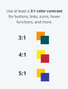
Color is a crucial element when making your website more accessible. Research has shown that around 1 in 12 men and 1 in 200 women have some degree of color vision deficiency. Good color contrast on a website means that all users can view visual elements and content, regardless of the device they’re using or the lighting in their environment.
For buttons, links, icons, hover functions, and more, a 3:1 color contrast should be used. It’s now easier than ever before to check the color contrast on your website by using Adobe’s new color accessibility tools.
2. Make Your Brand Stand Out
A well-designed color palette will not only separate your brand from the competition, it will also establish brand identity and awareness that will keep your name at the top of your customer’s mind.
In order to maximize this effect, it’s important to dive deeper into color psychology to understand how colors can give subtle cues to customers. For example, food industry brands often utilize the color red because of how it stimulates the appetite, dilates blood vessels, and increases heart rate. Blue elicits the opposite response and is responsible for a calming effect that is desirable by tech and wellness brands.
3. Build Brand Recognition
When you see an ad on Facebook or drive by a billboard, you may recognize the brand from a brief glimpse just based on its unique color palette.
Not only is color crucial in establishing your brand, it’s also necessary in building an online presence and retaining recognition in any environment. We have become accustomed to the green of Starbucks, the red of Netflix, and the blue and yellow of Ikea. These unique colors have bonded to the brand’s identity so closely, it’s nearly impossible to separate them from their name.
The key to this result is consistency. It’s vital to use your color palette in your logo, website design, and product design so that your audience knows it’s you when they encounter you in new locations or on new platforms.

4. Stay on Top of Trends
Just like any other element in marketing, color is also susceptible to the ebb and flow of trends. Staying on top of color trends in the current year means that you’re staying relevant to your customers and you’re at the forefront of your industry.
Instead of overhauling your entire palette based on current trends, it’s better to leverage your current branding and modify supplementary colors in your palette when needed. If you’re starting from scratch with a palette, it is useful to consider current color trends along with audience research and competitor analysis.
5. Include a Color Palette in Your Brand Guide
A brand guide is a brand’s instruction manual—it communicates the key elements that make your brand unique, such as typography, logos, imagery, and color palette. Including a color palette in your brand guide allows for exact color codes to be documented, including HEX, RGB, CMYK, and Pantone. These details are essential for any designer or printer. Color codes ensure that the shades of color used are exact and consistent, no matter if the color is posted online or printed.
Optimize Your Marketing Brand Colors with a Top Digital Marketing Agency
Whether you’re in the beginning stages of creating a color palette or interested in modernizing your existing palette, working with a digital marketing agency can help you maximize color theory to reach your business goals. Check out our design services and reach out to learn more about how Mad Fish Digital can help your brand stand apart.