We were excited to see a mix of new and old design trends surface in 2019, which brought back classics like Art Deco and introduced us to plumb serifs and grunge gradients. Each year, designers across the world make their lists of top design trends and debate which ones will apply to the brands they work with. Some trends get us excited, while other trends leave us scratching our heads. For instance… we’re grateful that last year’s brutalist websites didn’t take over the way some designers thought they might.
This year, we’re making our own list of trends we think designers will focus on in 2020, along with ways your brand can use them to your advantage.
These are the top 5 design trends we are excited to see in 2020:
- Sustainability
- Human-focused illustrations
- Motion
- Ultra-minimal
- Web Accessibility
1. Sustainability
As a Certified B Corporation, the Mad Fish design team is excited to put sustainable and conscious design choices at the top of our list. This year, brands are seeing more value in championing sustainability and the impact we all have on our environment.
Today, 62% of global consumers want companies to take a stand on the social, cultural, environmental and political issues close to their hearts. Brands in 2020–with the help of designers–will focus more on how to create sustainable products and services to meet their customers’ needs in their design work. Companies can do this in various ways. Whether it’s through the products they purchase, the materials they use (including inks and paper used in packaging), or creating marketing campaigns that visually highlight impact-driven information for the consumer, sustainability should be a top priority in 2020.
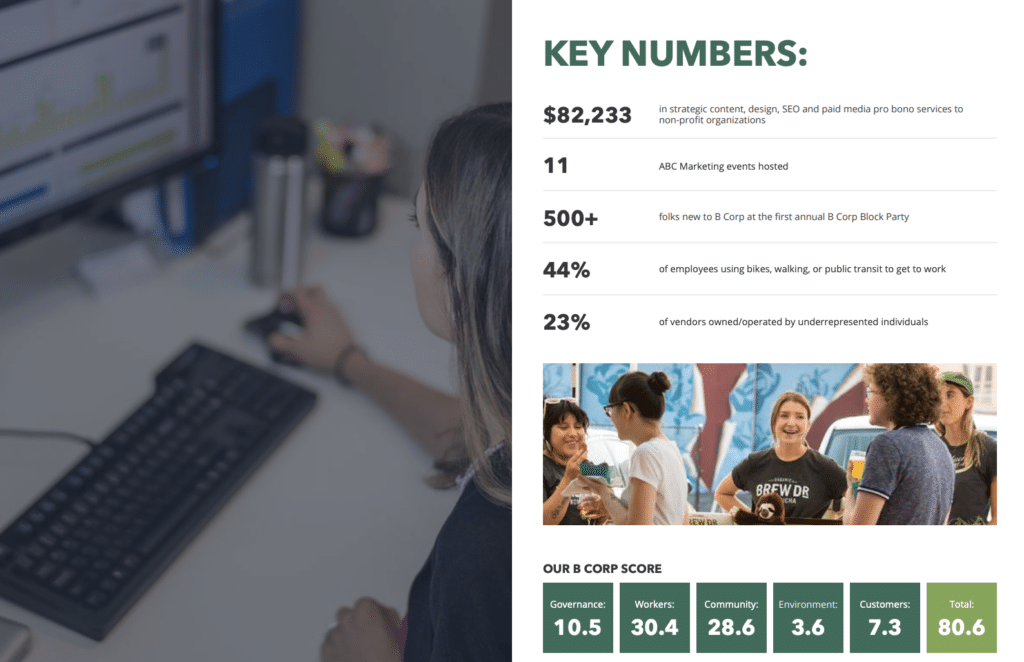
At Mad Fish, we were excited to release our social impact report to highlight the accomplishments we made within our work in 2019. We’ll continue to see great strides in the Portland community and beyond by further incorporating sustainability into our work as designers and the work we see in the conscious design choices made by others. Whether it’s Nossa Familia’s cup charge and zero waste cafe initiative or New Season’s bag credits, change is happening.
2. Human-focused illustrations
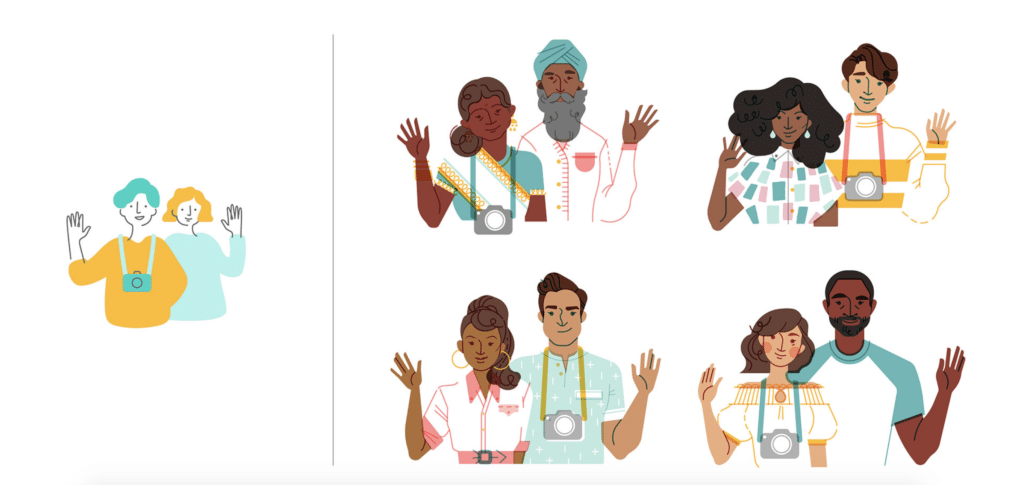
Airbnb’s Jennifer Hom wrote an amazing article earlier this year titled “Your Face Here” that takes a deep dive into the evolution of the illustrations they made of different people and demographics over the years. In it, Hom’s research showed a need for inclusive representation of Airbnb’s audience. “When a person appears as an outlined white space while their hair and clothing have color, it’s easy to assume they’re caucasian.” Their design team then went on to create new illustrations using real photos of people to ensure authenticity. This helped keep designers from drawing variations of their own face.
The rise of inclusive illustrations is felt across almost every industry, with everyone from SAAS clients like Sprout Social to DTC leaders like Casper. In 2020, it’s expected that more brands will follow this thought process and focus on the individual while also becoming more gender-neutral.
3. Motion
As Emma Newnes of B&B Studio states, with the rise of social media, our “attention spans get shorter and our desire for immediate gratification grows.” This makes short-form video the perfect fit. Wyzowl’s 5th annual state of video marketing survey asked consumers how they’d prefer to learn about new products or services and 68% said that a short video would be the best option. In 2019, 74% of marketers NOT currently using video as a marketing tool said they expect to start using it, which increased from 65% in 2018. This year, we’ll see more brands using motion in 2020 to engage the user at every step of the marketing funnel.
4. Ultra-minimal
In the last few years, there’s been a rise in ultra-minimal design across all platforms and channels. Whether it’s web design, package design, or print, these ultra-minimal designs are resonating with audiences. Ultra-minimalist designs also allow designers to focus on the message of the brand and strip away the non-essential elements, replacing them with white space. With the shorter attention spans we talked about, this helps users focus on a brand’s message in under five seconds. Not only do we see minimalism in design, but in lifestyle choices too. Marie Kondo, anyone? People are giving up unnecessary products to live a more focused existence.
5. Web Accessibility
With the 30th anniversary of the Americans with Disabilities Act (ADA) this year, there’s been a lot of buzz around what accessibility means in the digital age. Last year we saw multiple lawsuits against large brands positing that their websites or apps were not compliant. Most notably, a blind user couldn’t order a pizza through their app due to its inaccessible design choices, so they filed a complaint against Domino’s Pizza, which ended up in the Supreme Court. In 2020, we expect to see more brands updating their websites and apps to follow accessibility guidelines to meet the necessary needs of more people.
So, what does that look like? Some shifts will include adjustments that let screen readers read a website, underlining links for clarity, and making buttons larger and more comfortable to click. Additionally, improvements in color contrast and font sizes, images having alt-text (which also helps SEO—a double win) and being able to navigate through a website while using a keyboard are other ways that lead to increased accessibility.
Brands need to remember that by designing their website to exceed accessibility standards, they are improving their website’s design for all users. In addition, accessibility compliance doesn’t always mean someone with a long term disability, even something like breaking an arm can result in challenges that make navigating non-compliant websites frustrating or even impossible.
6. Dark Mode
In the last year we’ve seen Apple and Android push out software updates with the option of dark mode. What does this mean for your brand? Designers will need to consider what assets look like in light and dark mode. Dark mode puts the focus on the content and is said to be easier on the eyes, however, it will have major impacts on your design.
In dark mode your brand colors may be adjusted, your logo and any other PNG files may be hard to see, and can change your user interface. Brands will need to keep this in mind and adjust to accommodate for both light and dark mode.
Let’s talk about 2020 design trends! Questions? Inspiration?
If you’re wondering how to incorporate these trends, or feel like we missed one, feel free to shoot us a message through our contact form or reach out on LinkedIn or Instagram. We’d love to hear from you.