With over 51% of Americans having smart phones and tablets, it has become extremely important to make sure that your website renders on mobile devices the way it’s supposed to.
What Is Responsive Web Design?
A responsive design is one where the website adapts to the device that it’s being rendered on. In the example below you can see how this website looks on an iPhone (left), an iPad (middle) and a laptop or desktop (right). Not only does the size of the screen change, but notice the simplified iPhone version; it only has four links. There are other considerations besides layout, such as font size (iPhones and Androids have very small screens) and device limitations (for example, mouse hovering on mobile devices isn’t possible).

How Do You Know If You Need a Responsive Design?
Although all websites will need to be responsive in the very near future, understanding how much of your existing traffic is from mobile devices is crucial.
On Google Analytics you can go to Audience > Mobile > Overview and you’ll find a table like this one:
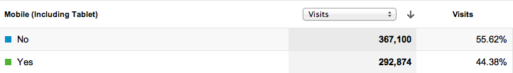
We can see that 44% of the traffic this website receives is from mobile devices. If this website didn’t render well on smart phone or tablets I’d be ignoring almost half of my visitors.
If you go to Audience > Mobile > Devices, you can actually see the type of devices sending traffic:
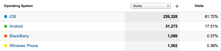
The report above shows the top operating systems. We can see that iOS (the operating system in all the Apple products like iPhones and iPads) represents a huge portion of my traffic. The following report shows the actual devices being used.
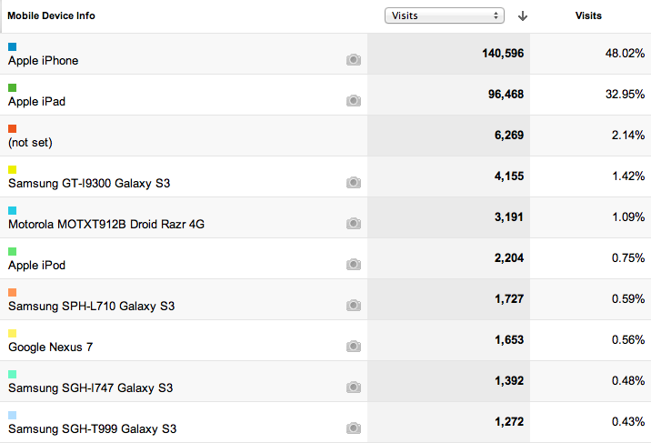
As you can see from these reports, I would be out of my mind not to optimize my website for iPhones and iPads, right?
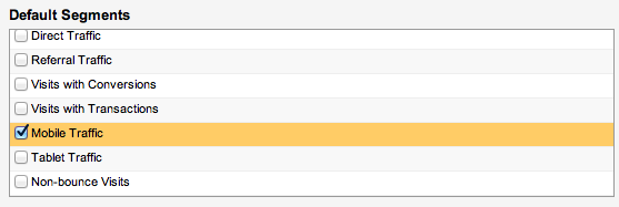
Mobile traffic is also one of the default advanced segments in Google Analytics, so it’s very easy to isolate mobile traffic so you can study it in more depth.
How to Create a Responsive Design
If you want to go the “do-it-yourself” route, I highly recommend this book: Responsive Web Design with HTML5 and CSS3. You should also check out these cool responsive web design examples. You can create a responsive design by coding a website from scratch or you can use one of these popular frameworks:
If you’re not a designer, talk to one and ask for a list of responsive web designs he or she has done. Then check them all on mobile devices and tablets to see if you like them.
Do you have more questions about responsive designs? Post them in the comments section below.