Since 2015, Google has been vocal about algorithm changes related to mobile-friendly websites.
In April 2015, we witnessed the first instance of “Mobilegeddon.” Google made a significant algorithm change designed to give a boost to mobile-friendly websites. In May 2016, Google rolled out an additional algorithm update that further emphasized ranking signals in their algorithm set to help their users find more relevant and mobile-friendly pages. If a brand didn’t have a mobile-friendly website before, one of these two updates prompted them to get one.
In November 2016, in an article on the Webmaster Central Blog, Google announced that they had begun experiments to make their index “mobile-first.” This meant that for some sites, Google was using the mobile version of that site’s content to assess the site against their ranking algorithm, not the desktop version.
Make sense? Mobile-first indexing and rankings can be a bit confusing. The following are the five questions we get asked the most about these changes Google is making and the answers that provide a bit of clarity. I hope this helps.
1. What does a Mobile First Index Mean?
Mobile-first means that the Google crawler uses the mobile version of a website’s content to assess how to rank the site using the Google algorithm. Historically, when Google assessed a website, the Google crawler fetched and renders the Desktop version of that site’s content.
2. When will Google move to a mobile-first index?
Google’s Gary Illyes has said that the initial rollout will occur in early 2018 but that the full rollout could take several years. The extended timeline is important to note. This is Google telling us that they are not looking to shake up the results too much in short period of time. Volatility is not Google’s friend.
As per Gary Illyes on December 18, 2017, currently “Google will be evaluating sites independently on their readiness for mobile-first indexing,” and that “this process has started for a handful of sites and is closely being monitored by the search team.”
3. What are the criteria for a website being ready for mobile-first indexing?
- Make sure the mobile version of the site has the most important, high-quality content
- Structured data is important for indexing and is a search feature that users love
- Metadata should be present on both versions of the site
- No changes are necessary for interlinking with separate mobile URLs (i.e. m.-dot sites)
- Check hreflang links on separate mobile URLs.
Click Here for the full list on Google’s Webmaster Central Blog.
4. How do I test how Google sees the mobile version of my website?
To test your website’s design on mobile, use the Google Search Console. In the left-hand nav of the Google Search Console, go to: “Crawl” -> “Fetch as Google”, select “Mobile: Smartphone,” and enter a sub-page url, or no url if you are checking the home page. To begin, click “Fetch and Render.”
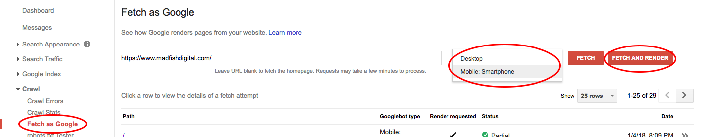
You will see your site’s page appear in the table below. Click anywhere on the row, and you will see a screenshot for how Google sees the page, and how visitors see the page. It is important that both screenshots look correct. If for any reason, one version is dramatically different from the other, contact your webmaster and have them make the necessary updates so that the site appears correctly.
To test mobile page speed performance, use Google’s mobile speed test tool to test your website’s performance. The Think with Google mobile speed test tool will tell you everything from how quickly your website will load in a 3G environment, to how your website benchmarks against other sites in the same industry.

5. What should I expect if my site’s already mobile friendly?
According to Gary Illyes, not much should change. According to Illyes “If you have a responsive site, then you’re pretty much good to go.”
Conclusion
Google’s emphasis on mobile first should pay dividends for the end user. While rolling out website changes can be stressful on a brand’s marketing and dev team, by focusing on mobile performance, websites will be forced to improve load times, focus on the most important content, and optimize the user experience in a way that helps visitors find what they are looking for faster, and on a smaller screen.
At Mad Fish Digital, we are excited to see these changes. We are optimistic about Google’s ability to roll these changes out gradually and in a manner that is less disruptive to the overall Google search experience.